My final image was ok, but i was a bit disapointed because i thnk i could of done better.
I do think this has improved my photo shop skills as i find useing tools alot easyier and i do not need to ask for help contantly as i did before.
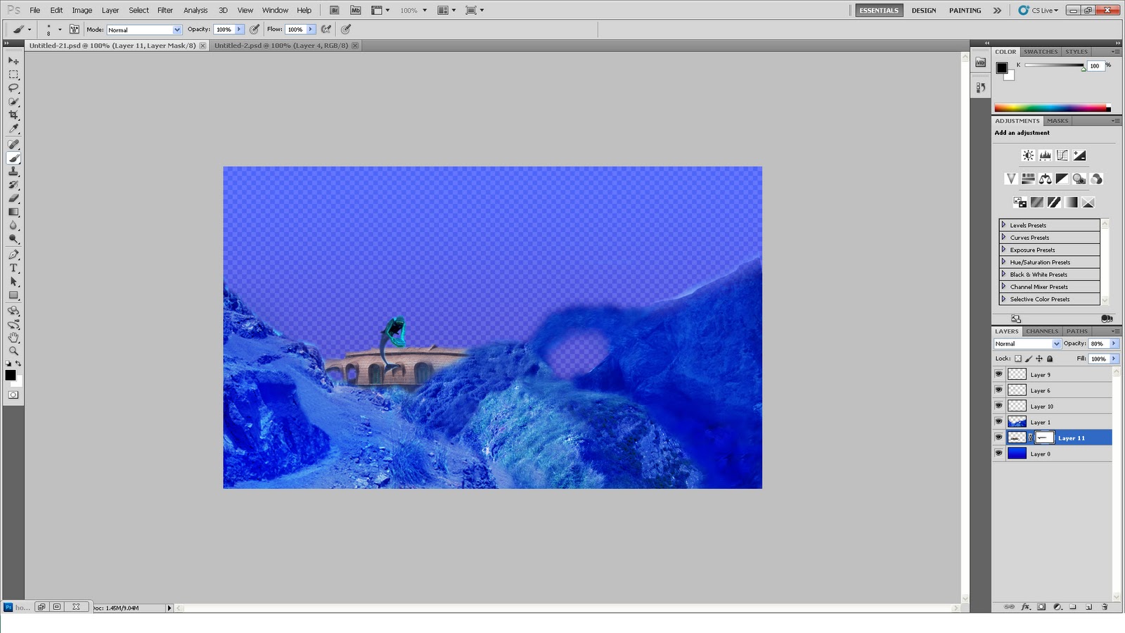
Throughout this image i was useing tools like smooth,stamp, brush, magic wand, mask, layers. hue and saturation and a few more. most of these where used to add a smooth merge between all the layers.
I am confident with my photo shop skills and beleve i could of done better then this . maybe . but i dont fear the work photoshop as i did at the start of the project having never used photo shop before.
I changed the image i described from my proposal, i originaly wanted to get a water reclaiming land look but ended up changeing it quite a bit, i got rid of the eveolution side of it ( a halfman half fish) and the city i was going to put in was scraped. i changed it to more natural things like hills and mountains and managed to achieve a look i was satisfied in.
I made a house from a house boat removeing the bottom half and adding a new layer to the top and copying a window and stamping it along the boat i also made the boat less blue , creatieng a focus point of the image.
the fish in the back ground are to reinforece the fact it is under water along with the blue of all the images of the picture if self.
Wednesday, 29 September 2010

Current evaluation
I have removed teh diver because he does not realy add anything for the image, i am trying to add more depth too the image by layering it, adding effects and deeper colours in the background and putting things in the distance which give more life to teh back ground.
I wouldnt say its a master peice and i think i could do better but . this is what i have now and im doing my best oto make the image work. i dosent look stupidly unreal and the house image i added is alittle brighter then the other images to catch the eye.
I wouldnt say its a master peice and i think i could do better but . this is what i have now and im doing my best oto make the image work. i dosent look stupidly unreal and the house image i added is alittle brighter then the other images to catch the eye.
Health and Safety


We learnt what the best seating postions where. the proper posture, how to adjust the seat and how to postion the screen properly.
and when to take a break.
Mind Map

The entire class was involved in makeing the these, we swaped around the room adding so we had a massive list of things.
Tuesday, 28 September 2010
Use of Touch Screens And Graphic Tablet
The Graphic Tablet and Touch screen have both come in handy at diffrent times, epecialy when you need to remove or do precise movements.
for example i used the touch screen in my first project while useing the smudge tool, makeing an arced angle which was alot easier and look more fulid and natural then if i used the mouse.
Eraseing useing a touch screen or Graphic Pad makes it alot easier because your movements are not as restricted.
Update on Final Product
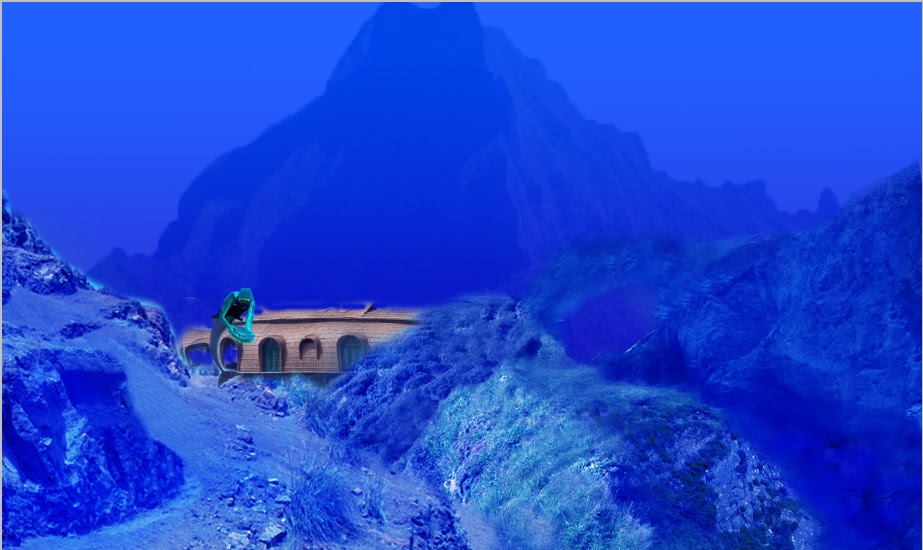
a update on my final design, it has a few new things added and im tweeking the colours. the idea is maybe to get a volcano look on that moutain in the back ground. put some more fish and make it look more sea like.
Past And Failed Ideas

I started this but then did not like what i had made, originaly it was going to be made so, you sould see the sea life under the island. but i lost intrest and did not know how to continue it.
Also another idea i had was reflecting a city in the water but the city being in a opposite state in the refection, so if the city was bursting with life and was shiney on the island it would be empty lifeless and in ruins in the reflection.
Monday, 27 September 2010
Final Product
I merged all the layers that where the same or related
like the scenery was all merged once all in place and i thought it was sutible. i move the layers dependsing on what depth i want . like the boat/house is in the back ground so it is behind the scenery its self. and i wasnted the diver too look in the distance so i turned the opacity down and made him smaller.
The images i am useing . Progress so far.

This Image shows where i am so far, i have made all the diffrent pictures look unique and diffrent deleteing parts with masks , laying over one another or useing the stamp tool.
 with this image i used the stamp tool and took the fleshy tones from his arm and stamped them on the body createing a skin like texture, then i removed the tank on his back.
 The picture on the left was masked and i removed parts of the sea and parts of the cliff so it would look just like a hill. by useing mask this ment i didnt need to worry if i removed the wrong part because it would be easy to get bakc to the normal.
 The same progress was used for this cliff as the last one.
  The same process was used with this cliff as the last two.
Thursday, 23 September 2010
Proposal
Proposal:
Our Task is too create an image related to underwater life. having allready done a mind map ideas are easier to come across.
My idea is to create a underwater world , say in the future when the icecaps melt, or something along those lines. i will create an underwater enviroment that looks natural with hills caves. and put an adaptation of a human, like a mermaid sorta thing.
it will look slightly like the sea is reclaiming land .
it will look slightly like the sea is reclaiming land .
i have also thought of doing an image showing that will look like it was taken half above and half underwater. this idea qould of required alot more skill and process's that i think i would of been able to coup with, so i have not chose this one.
Source of images
I have got most of my images from the internet, allthough i have though of useing books(takeing images from a book scanning) or takeing my own pictures ( like going to an aquarium or beach)
I have got most of my images from the internet, allthough i have though of useing books(takeing images from a book scanning) or takeing my own pictures ( like going to an aquarium or beach)
Format Selected and why:
I have picked a landscape base because i believe it is the most suitible formy image because i want it to have sceneray and spand across all the page.
Inspiration
I found inpiration on many websites includeing revolution arts and on searchs through google , many of them had ideas ive never thought of.
Wednesday, 22 September 2010
Serifs - Sans serif - Script
Aa This is a serif type face. serifs are the flicks on the end of character.
Aa This is a Sans- Serif
Script is the squirly character's example French script.
kerning: is the soace between the individual character's
Ledding is the line spacing.
Leopard skinned Rhino.
today we made a rhino with lepord print skin.
we took two images one of a rhino and one a leopard, and placed the leopard over the rhino in another layer lowering the opacity so we could so the leopard could be moved and tilted till it was overing most of the rhino.
useing the liquify tool the leopard image was blended and manipulated into covering as much of the rhino as possible.
A mask was used to remove unwated parts of the leopard, the tail, extra leg and eyes.
After useing the liquify the stamp tool was used to take a section of the leopard print and paste over other sections that would other wise be to hard to cover.
the mask was then used again to remove the leopard skin off other parts of of detail, Like the rhino ears, Horn , Gum. and other aprts which ould not be covered by skin
Images will not upload, but! you cna see what end result on other peoples blog from the class.
Tuesday, 21 September 2010
Lizard/Hippo

This was the back ground image we worked up from.
Today we where given a totorial in mergeing two pictures together makeing them look inplace on one another, we hot 2 images a hippos head and a lizard. we used the lizard as a back ground and put the hippos head in another layer and worked it into blending with the main image of the lizard . 
Use free transform, and then shift to move it at the same scale/proportion, then move over the head of the lizard I added an adjustment layer of colour balance.

Using a mask I deleted the removed and faded parts of the hippo’s head to make it look more natural and in place.
Changing the opacity effected how strong the brush was


Using the stamp tool I covered over the nose with a section of the back ground. Which covered up the lizard’s nose, covering it with a background

over all ithnk that is came out as well as i wanted because it looks all like one picture not loads of diffrent parts stuck onto a lizard.
this has also helped to progress my photoshop skills and i feel more confident useing masks and adjustment layers.
Sunday, 19 September 2010
Simone Legno - TokiDoki

Simone Legno - Toki Doki

About Simone Legno
Simones Legno's Portfolio website was found by Pooneh Mohajer the co founder of "Hard Candy cosmetics", and her husband Ivan Arnold, and arranged to meet him in los angeles to begin the TokiDoki Business venture.
Legno's portfolio website was listed as one of the top ten websites of the week by The Independant 2003
About TokiDoki
 TokiDoki is a japanese insiped lifestyle brand created in 2005.
 Headquartered in Los Angeles, CA, tokidoki was founded in 2003 by designer Simone Legno and his partners Pooneh Mohajer and Ivan Arnold.
An innovative line of apparel, handbags, cosmetics, accessories and more, tokidoki has built a worldwide following with its larger-than-life characters and designs.
The brand’s cult status has fueled high-profile collaborations with Karl Lagerfeld, LeSportsac, Onitsuka Tiger, Marvel, New Era, Hello Kitty, Fujitsu, Levi's, Smashbox cosmetics, Xbox, T-mobile, Fornarina, Skullcandy and Medicom Toy.
Other Artwork


Why?

I believe photo shop was used on this image.
The use of layers may have been used to create depth puting characters behind and infront of one another chanceing the focus point.
Bringing up the contrast of the entire picture could also have been used giving more impact to the picture.
Masks could oh been used, editing out areas around a picture if each one was added individualy.
Thursday, 16 September 2010
Iceberg Research

http://naturescrusaders.files.wordpress.com/2009/12/wq-iceberg-underwater.jpg
This image apears to be a painting.Another shade of colour was used on the angled sides of the icebergs bottom acting as a reflection in the cold water. The image also has a flat perpective

http://adsoftheworld.com/files/images/Iceberg3.jpg
this image was likely made in photo shop. due to the image that is underneth the surface of the water and the effects of the coulds with tthe building. this mage looks like it is composed of 3 images originaly, the background(sky and sea) , the building(nuclear powerplant) and a underwater image (the explosion) each picture is possibly layerers.

http://www.bigbluetech.net/big-blue-tech-news/wp-content/uploads/2009/10/cave_diver_1_1495370c.jpg
divers inside an iceberg. i believe photography was used to capture the entire image.
contrast in colour could of been altered useing photoshop giveing a colder and more solitude feel to the image.
also it coudl be that the divers where added seperately useing another alyer and image , and blended into the background image useing oclation.
and masks to clear the any extras off the diver image that could make it look out of place.
D.P.I ,Vector images and Bitmaps
D.P.I - dots per inch the human eye can only see 300 dpi, but if its higher then300 the image becomes shaper. the higer the dpi, the larger the file and the longer it will take to upload save and open.
Vector graphics is the use of shapes such as points, lines, curves, and shapes or polygon's, which are all based on mathematical equations, to represent images in computer graphics. because its a math algorithm it takes up less space then a bitmap
Vector images do not get pixalated like bitmaps because they are circular and not made if lines of colours but equastions and maths .
Pixal images are remembered on a bitmap, which remembers the colours in order for each line. e.i red red ,red , lighter red, pink , white. because it records all of the colours in each line it requires alot of memory to bs saved
bitmap images will get pixalated if made too large or too small.
Wednesday, 15 September 2010
Hideo Kojima
Hideo Kojima
Source: wikipidia
Source: wikipidia
 About him
Born August 24, 1963
A Japanese movie director originally employed at Konami. Formerly the vice president of Konami Computer Entertainment Japan, he is currently the director of Kojima Productions
He is the creator and director of a number of successful video games, including the Metal Gear series, Snatcher, and Policenauts and also produced both the Zone of the Enders and Boktai series.
Kojima is consistently named by fans and industry experts alike as being one of the most influential and innovative video game directors and writers of all time.
Influences
Movies would also have influence on other aspects of his games.
Hal "Otacon" Emmerich (named after HAL from 2001: A Space Odyssey).
Sniper Wolf shooting Meryl in Metal Gear Solid (Full Metal Jacket).
Psycho Mantis (inspired from the film The Fury).
the whole Metal Gear stealth concept (The Great Escape and The Guns of Navarone).
James Bond also had a large influence on the Metal Gear series, with Metal Gear Solid 3 having a James Bond-like introduction sequence.
Games released
Snatcher series - Writer/Director
 Tokimeki Memorial Drama series - Planner/Producer/Drama Director/Executive Director
Zone of the Enders series - Producer
Boktai series Game - Design/Producer
Castlevania series - Executive Producer
- Penguin Adventure (1986: MSX) – Assistant Director
- Lost World (1986: MSX, cancelled) – Writer/Director
- Policenauts (1994: PC98, 1995: 3DO, 1996: Playstation, 1996: Saturn) – Writer/Director
- Stock Trading Trainer : Kabutore (2006: Nintendo DS) – Producer
- Kabushiki Baibai Trainer Kabutore! Next (2007: Nintendo DS) – Producer
- Super Smash Bros. Brawl (2008: Wii) – Designer of Shadow Moses Island stage.
- Twelve Tender Killers (2008: Mobile Phones) – Producer
- Gaitame Baibai Trainer: Kabutore FX (2009: Nintendo DS)

Awards
Newsweek named Hideo Kojima as one of the top ten people of 2002.
In 2008, Next-Gen placed him #7 in their list of "Hot 100 Developer 2008
In early 2009, IGN placed him sixth in their Top 100 Game Creators of All Time list.
He has also been awarded the first ever Lifetime Achievement Award handed to a game designer at the 2008 MTV Game Awards
Was also honoured with a Lifetime Achievement Award at the 2009 Game Developers Conferen.
Why i like his work!
He also knows how to create scenes with emotion making people feel sorrow moving the camera adding effects and changing colours to create the reaction he wants for the cut scene or section of the game.

I think Photography could of been used or manipulated ,photos of a street digitaly transforded/added to it.
It looks like saturation was used to create a atmosphere , makeing it dark/gloomy to create the mood which in this picture would be scary or dangerous.
The perpective looks towards the sky , makeing that character bigger more boss like whos strong and above the rest.
ocolation could of been used to help get a dusty effect with the two robot, makeing them look furter away and giveing it more depth.
Also layers could of been used, so the characters, the building, the car and sky could be put in defrently.
colour tones have been kept dark to give a tense amost hostile atmosphere.
Hyung-Tae Kim
Hyung tae Kim
Source: Wikipidia
Hyung-tae Kim is a Korean artist who has been extremely successful in the game industry. He has designed characters foe games such as the Magna Carta series, and war of Genesis series.

about him!
· He was born on the born February, 1978 in Seoul
He began his career in the game industry in the back ground music field. He moved into art and design, expanding into other areas just than gaming specifically. He has worked as a cover artist for comics and has contributed towards the Udon street fighter series.
His character designs can be seen in games almost every game he has worked on through the Magna Carta series and the genesis war, there are already concepts from games he is working on showing of his character designs.
His employment history has not left Asia and is currently working with NCsoft
He draws in a Manhwa style, which is a style influenced by the dramatic modern history of Korea which diverse from the form or genre
Kim is an artist in the manhwa style. His latest artworks use a deformation technique where Kim disregards anatomical accuracy to achieve a specific feel to the character.
Current Projects
· He is currently working on a game called blade and soul which contains major influences from Asian martial arts and fantasy. This is a much anticipated online game which is predicted to take the mmoworld by storm with its environment, graphics and game play.
· Recently unveiled character artworks for Magna Carta 2 show that Kim has been working with SoftMax. There is no information released regarding the relationship between Kim and SoftMax for this game.
Why I picked him
I choose him because I find his art eccentric, being more than just an idea on paper. The way he digitally adds to a picture binging it more to life making it more define and unique, not one of his pictures look the same.
I enjoy concept arts and find he is one of my favourites. Being he takes on entire games worth of characters and successfully designs the entire game without a same old same ol feel to it.
I like the freedom he can bring to the picture or the emotion he can show through it. He also pays attention to the little details of the characters so nothing looks static and emotionless. Which makes all the picture flow and not static.
This is a concept from one oh his games.
This is a concept from one oh his games.

Layers could oh been used, each character being indevidual and put on top of each other to add a depth the front one being the main point of view.
i dont think photography was used because their is no structures or anything that could be realted to something in real life.
i think atht the tones and shades add are used to add a dept amkeing it look 3d, not just a flat image and also bring the picture to life.
saturation with an orange tone making the picture look more realistic .
Highlights have been used on legs using a ligher tone of orange or white to make it shine.
The colour tones are all warm so he is keeping to a orange/brown colour pallet, which give sit a warm effect.
Highlights have been used on legs using a ligher tone of orange or white to make it shine.
The colour tones are all warm so he is keeping to a orange/brown colour pallet, which give sit a warm effect.
Tuesday, 14 September 2010
Photoshop Task2 - Underwater Scene
Today I made an underwater scene which was made of 3 separate images a shark, a wrecked plane and a garden.


First putting the garden picture on I saturated in blue which gave it a underwater look, making the leaves turn a blue and the stones look like the gravel in a fish tank. Using the gradient tool I started to get the look of water putting a dark blue as foreground colour and light blue as background.
The gradient provided a smooth change between the colours. Which when out into the top quarter of the screen gave dept, the lighter water looking closer to the surface?
Another layer was made and the same process was used this time blocking out the entire garden except the ground/stones.
A black layer was added and a noise was added to the screen making it look like static , the opacity was used fading it into the back ground. and the shades were changed allowing it to look like water catching the light ect.
the second picture added was the plane which , we extended the top oh the plane picture , just above the cock pit so it didn’t distort the picture and raised it too the top. i extended the picture so it filled up the sides and use the gradient tool, set to colour to transparent. and blended in the ground with the bottom of the plane.
I added the shark picture and turned on the mask and erased as much of the original blue of the picture. after removing most of the blue, i used the adjustment layer Levels to make the shark blend into the back ground.
This was the end result.

I am pleased with the end result my picture had the look i wanted and doesn’t look too much like all the pictures where separate, I can’t tell there was a garden picture, and the hardest part for me was making the shark look in place .
With made me experiment though the levels of the mid tones shadows and highlights, and also opacity.
I think my photo shop skills are improving and I am finding it easier to use. the more i use it.
Subscribe to:
Comments (Atom)